Education First Federal Credit Union
The Challenge
As demographics grow, change, and evolve, sometimes credit unions must also evolve and adapt to stay relevant to not only their existing member base, but also to a new member base as well. Education First FCU wanted to move to a steadily growing market in Lumberton by creating a flagship branch that would appeal to a large number of community members. They also wanted to provide their community with a space to meet outside of regular credit union operating hours. Education First FCU already had the location and site picked out, but they needed someone to build the space from the ground up, with full-service retail branch capabilities and ample space for community members. NewGround was happy to bring Education First FCU’s groundbreaking vision to life.
The Journey
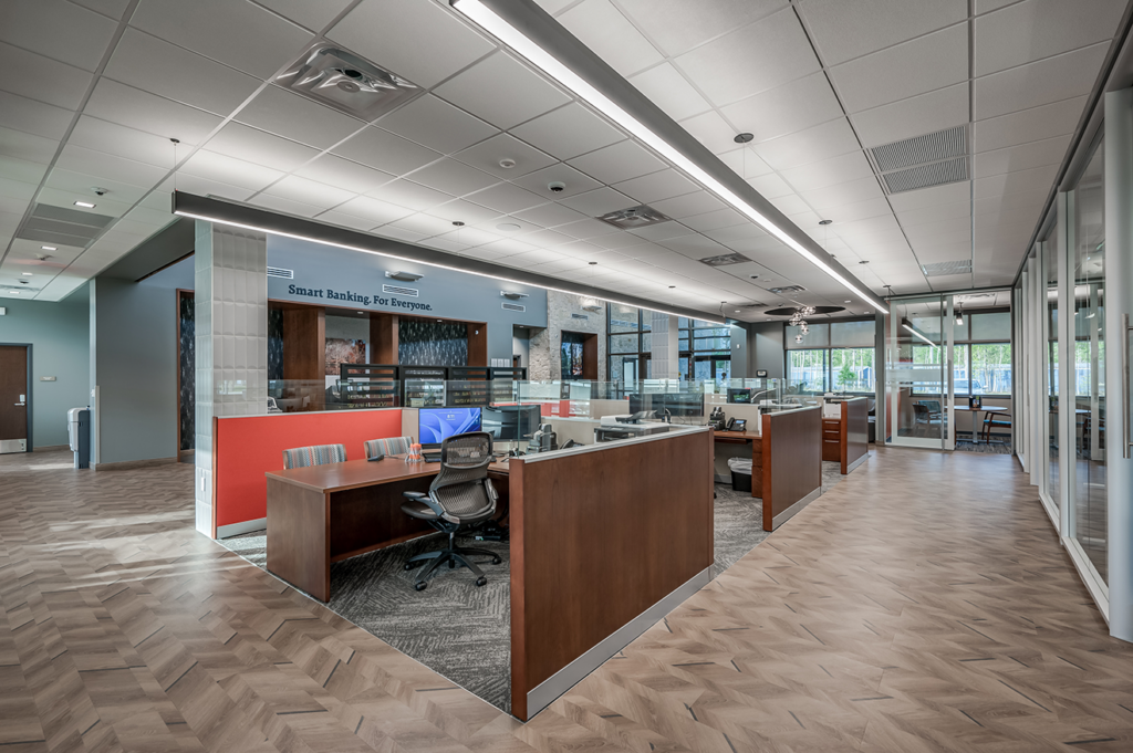
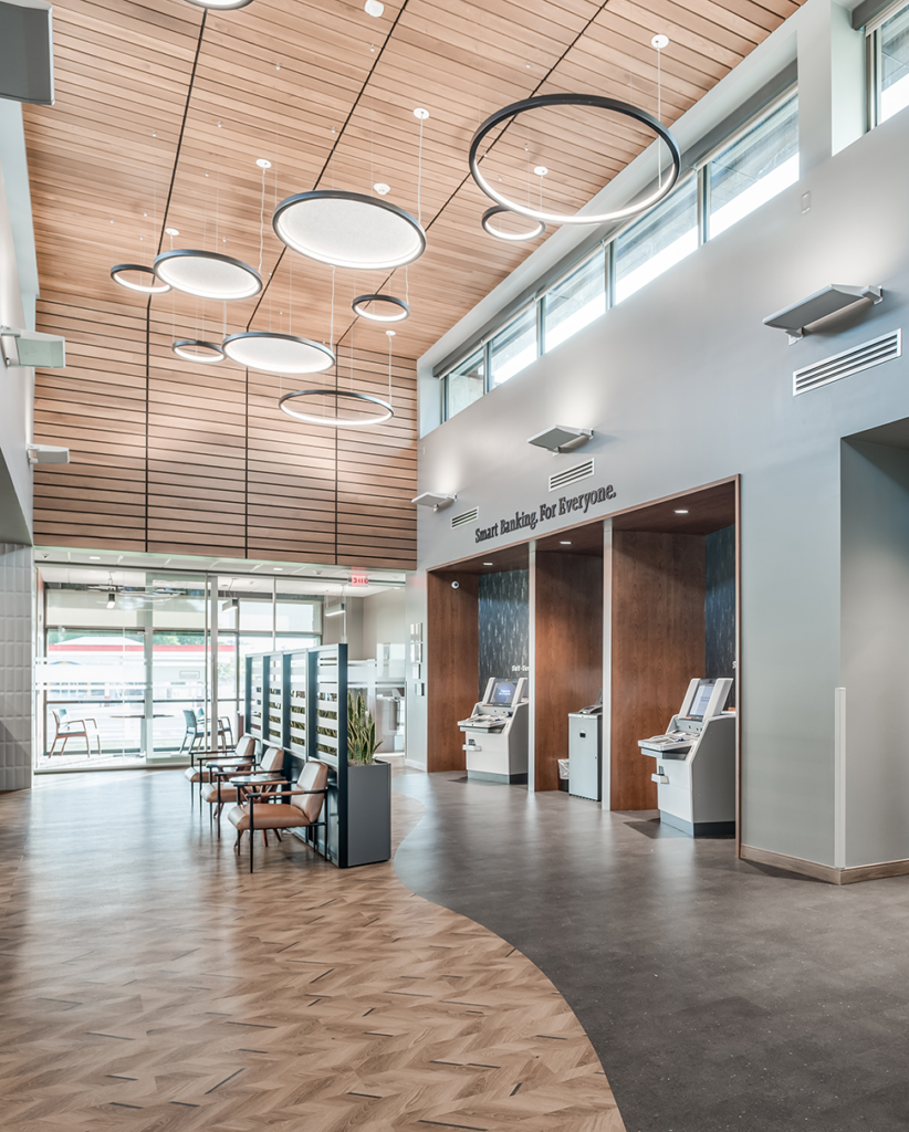
The start of any project journey begins with strategy and design. For this flagship location, Education First FCU asked NewGround to create a design that would closely match the look and feel of their recently built main office building. The inside, however, needed to feel warm and inviting, a fresh take for their members that could help push the overall brand forward. The team created this by designing a space with high ceilings that created an open space up through multiple stories. Wood finishes helped create that cozy feeling Education First FCU was looking for, while the environmental graphics package created an industrial and modern look brought about by fusing different materials, turf styles, patterns, and colors. A full furniture package completed the look and helps welcome in members.
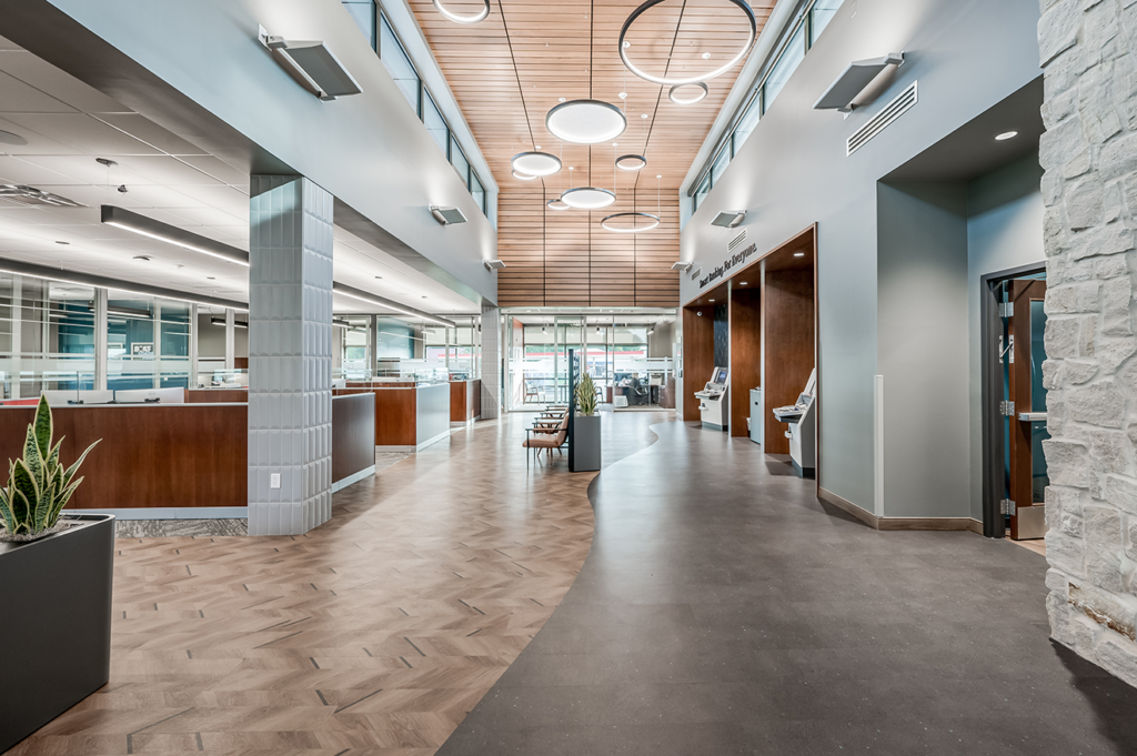
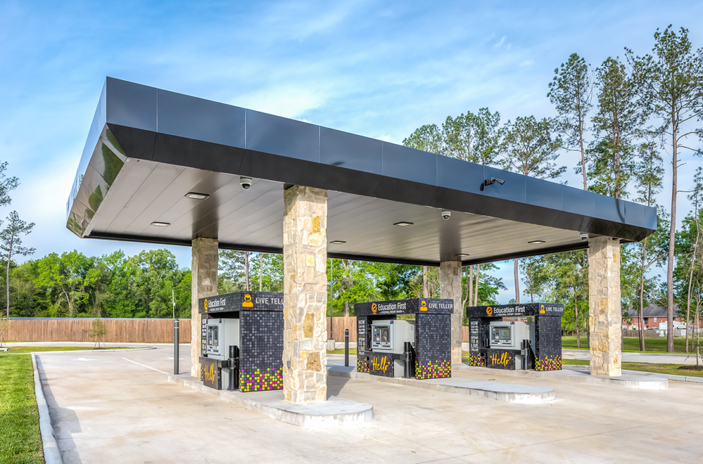
In terms of the functionality of the site, Education First FCU wanted to try a new model for their clients to interact with. Instead of live tellers and teller stations, they instead wanted to implement interactive teller machines tied closely back to their main systems. The designs had to be uniform, cohesive, and include touch points for clients to guide them to where they needed to go, with the help of staff still on-site to assist.
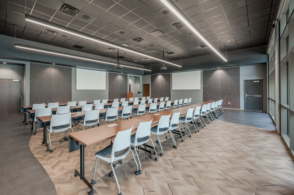
Lastly, the client wanted a community/training room that could be used by external groups after hours. This space was built to handle a large number of seating possibilities depending on the group size and meeting type and was crafted to operate completely independently of the main branch for after-hours use. A large parking area was also built to accommodate visiting members and community meetings.
The Destination
The Education First FCU space is a testament to financial institutions and businesses looking to connect with their communities. From the rich interior design and furniture layout that welcomes guests and members alike, to the elaborately crafted meeting rooms equipped with the latest technology, the entire space is built to welcome and encourage collaboration and engagement. NewGround was happy to work on this project for Education First FCU and is excited to see what the future holds for this inviting branch.
THE DETAILS
THE CHALLENGE
As demographics grow, change, and evolve, sometimes credit unions must also evolve and adapt to stay relevant to not only their existing member base, but also to a new member base as well. Education First FCU wanted to move to a steadily growing market in Lumberton by creating a flagship branch that would appeal to a large number of community members. They also wanted to provide their community with a space to meet outside of regular credit union operating hours. Education First FCU already had the location and site picked out, but they needed someone to build the space from the ground up, with full-service retail branch capabilities and ample space for community members. NewGround was happy to bring Education First FCU’s groundbreaking vision to life.
THE JOURNEY
The start of any project journey begins with strategy and design. For this flagship location, Education First FCU asked NewGround to create a design that would closely match the look and feel of their recently built main office building. The inside, however, needed to feel warm and inviting, a fresh take for their members that could help push the overall brand forward. The team created this by designing a space with high ceilings that created an open space up through multiple stories. Wood finishes helped create that cozy feeling Education First FCU was looking for, while the environmental graphics package created an industrial and modern look brought about by fusing different materials, turf styles, patterns, and colors. A full furniture package completed the look and helps welcome in members.
In terms of the functionality of the site, Education First FCU wanted to try a new model for their clients to interact with. Instead of live tellers and teller stations, they instead wanted to implement interactive teller machines tied closely back to their main systems. The designs had to be uniform, cohesive, and include touch points for clients to guide them to where they needed to go, with the help of staff still on-site to assist.
Lastly, the client wanted a community/training room that could be used by external groups after hours. This space was built to handle a large number of seating possibilities depending on the group size and meeting type and was crafted to operate completely independently of the main branch for after-hours use. A large parking area was also built to accommodate visiting members and community meetings.
THE DESTINATION
The Education First FCU space is a testament to financial institutions and businesses looking to connect with their communities. From the rich interior design and furniture layout that welcomes guests and members alike, to the elaborately crafted meeting rooms equipped with the latest technology, the entire space is built to welcome and encourage collaboration and engagement. NewGround was happy to work on this project for Education First FCU and is excited to see what the future holds for this inviting branch.