Merced School Employees Federal Credit Union
The Challenge
Sometimes a partnership can start small and grow into something much bigger and greater. For Merced School Employees Federal Credit Union (Merced FCU), they knew they wanted to build a new freestanding branch. They already had a site picked out too; however, they needed someone to help them with site surveys, due diligence on the property, and general strategy. We were more than happy to help with all of this, but as the client began to delve deeper into the strategy and project development process, they realized they needed more than just strategy. They needed a full design and build partner. Thankfully, we could help with that too.
The Journey
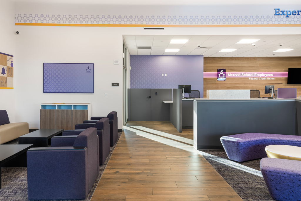
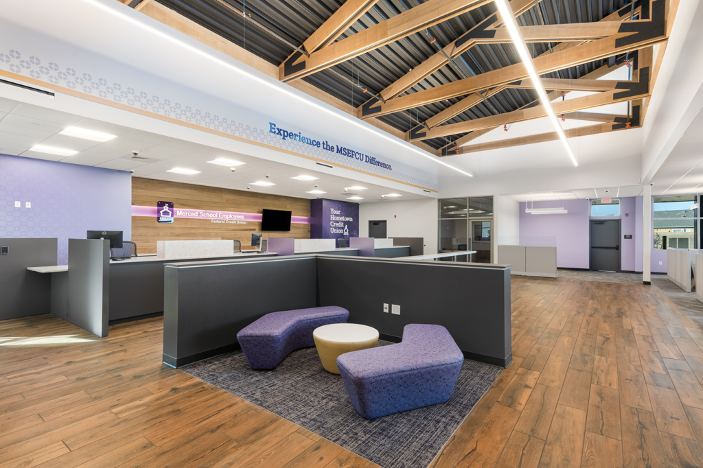
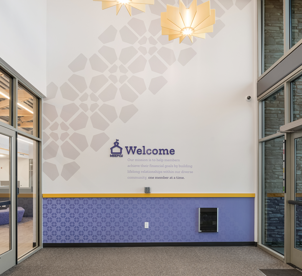
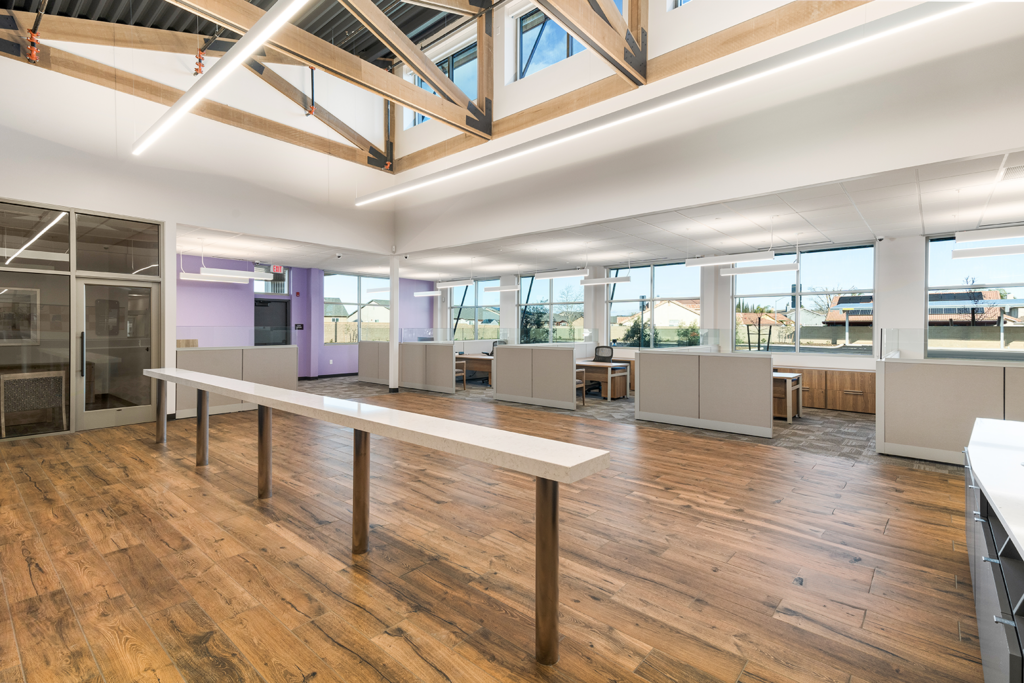
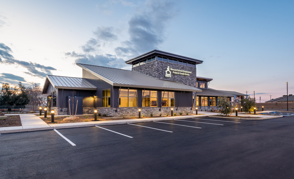
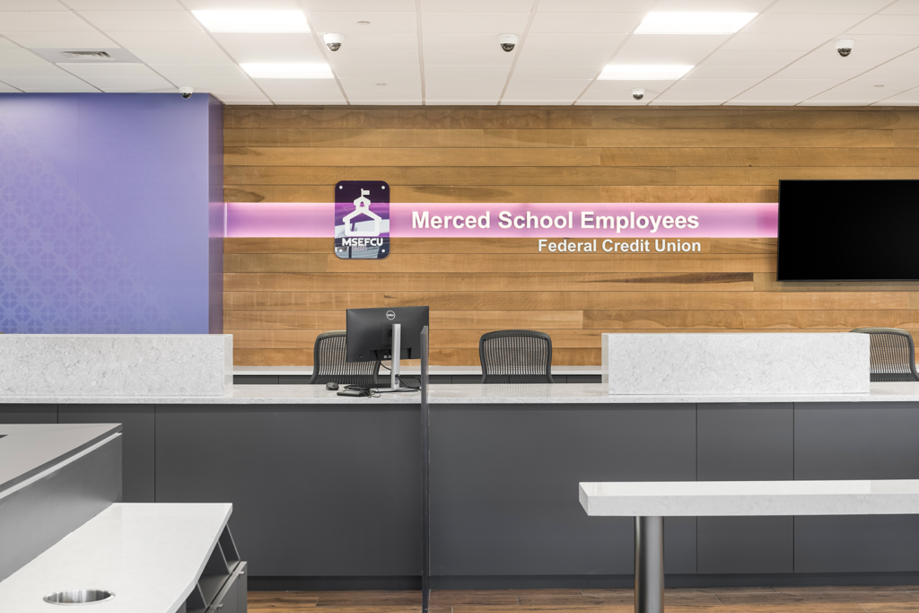
Merced FCU valued collaboration and open communication through every phase of the project, and immediately communicated to NewGround some of the core values and themes they wanted to present throughout the space. They wanted big windows that would let in plenty of natural lighting and wanted a purple color scheme showcased throughout the space. However, they also wanted a space that would blend the complex external zoning and building requirements throughout the interior as well. The city that the branch was being built in required the building’s exterior to match a certain look and feel, described as a “rural agrarian tone.” To accomplish this, the exterior of the space utilized brick, metal, and wooden tones and unique angles that still created a sophisticated look while matching city requirements. They even constructed a silo on the side to hide mechanical condensers and create an interesting focal point for the space. These agrarian themes, along with the purple color scheme, were pulled into the interior of the space with wooden finishes, dark and light purple tones, rustic materials, exposed beams, and unique textures. We also created a back wall illumination to draw eyesight to their logo. Environmental graphic specialists also highlighted Merced FCU’s mission statement and core values.
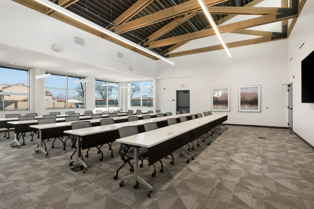
Merced FCU welcomed their community into the space and wanted them to be closely tied to this new location. To accomplish this, they had a large community room constructed that is wide enough to hold regional meetings and community events. Furthermore, they wanted all visitors, be they members or not, to be able to have ample parking and comfortable access to the space. To accommodate this, NewGround built a separate solar-covered parking area that could fit both visitors and employees, providing them with shaded space. Charging stations for electric vehicles were also included to future-proof the space.
The Destination
While zoning requirements and guidelines may have initially posed a challenge, by embracing the creativity and unique innovations of NewGround’s teams, Merced FCU was able to create a space that could set a principle and guideline for all future businesses in the area. They embraced the history and tradition of their community both inside and out, and as a result, have a unique, groundbreaking space that is future-proofed for years to come. We were happy to help Merced FCU create such a dynamic space, and look forward to what the future holds.
THE DETAILS
THE CHALLENGE
Sometimes a partnership can start small and grow into something much bigger and greater. For Merced School Employees Federal Credit Union (Merced FCU), they knew they wanted to build a new freestanding branch. They already had a site picked out too; however, they needed someone to help them with site surveys, due diligence on the property, and general strategy. We were more than happy to help with all of this, but as the client began to delve deeper into the strategy and project development process, they realized they needed more than just strategy. They needed a full design and build partner. Thankfully, we could help with that too.
THE JOURNEY
Merced FCU valued collaboration and open communication through every phase of the project, and immediately communicated to NewGround some of the core values and themes they wanted to present throughout the space. They wanted big windows that would let in plenty of natural lighting and wanted a purple color scheme showcased throughout the space. However, they also wanted a space that would blend the complex external zoning and building requirements throughout the interior as well. The city that the branch was being built in required the building’s exterior to match a certain look and feel, described as a “rural agrarian tone.” To accomplish this, the exterior of the space utilized brick, metal, and wooden tones and unique angles that still created a sophisticated look while matching city requirements. They even constructed a silo on the side to hide mechanical condensers and create an interesting focal point for the space. These agrarian themes, along with the purple color scheme, were pulled into the interior of the space with wooden finishes, dark and light purple tones, rustic materials, exposed beams, and unique textures. We also created a back wall illumination to draw eyesight to their logo. Environmental graphic specialists also highlighted Merced FCU’s mission statement and core values.
Merced FCU welcomed their community into the space and wanted them to be closely tied to this new location. To accomplish this, they had a large community room constructed that is wide enough to hold regional meetings and community events. Furthermore, they wanted all visitors, be they members or not, to be able to have ample parking and comfortable access to the space. To accommodate this, NewGround built a separate solar-covered parking area that could fit both visitors and employees, providing them with shaded space. Charging stations for electric vehicles were also included to future-proof the space.
THE DESTINATION
While zoning requirements and guidelines may have initially posed a challenge, by embracing the creativity and unique innovations of NewGround’s teams, Merced FCU was able to create a space that could set a principle and guideline for all future businesses in the area. They embraced the history and tradition of their community both inside and out, and as a result, have a unique, groundbreaking space that is future-proofed for years to come. We were happy to help Merced FCU create such a dynamic space, and look forward to what the future holds.
